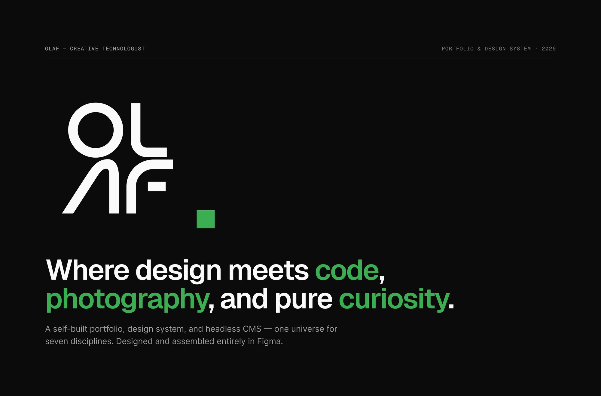
Creative Technologist
A portfolio, design system and CMS — designed end to end in Figma
- Services
- Product Design · Design Systems · Art Direction · UX Writing · Prototyping
One system, soseven disciplines couldstop competing.
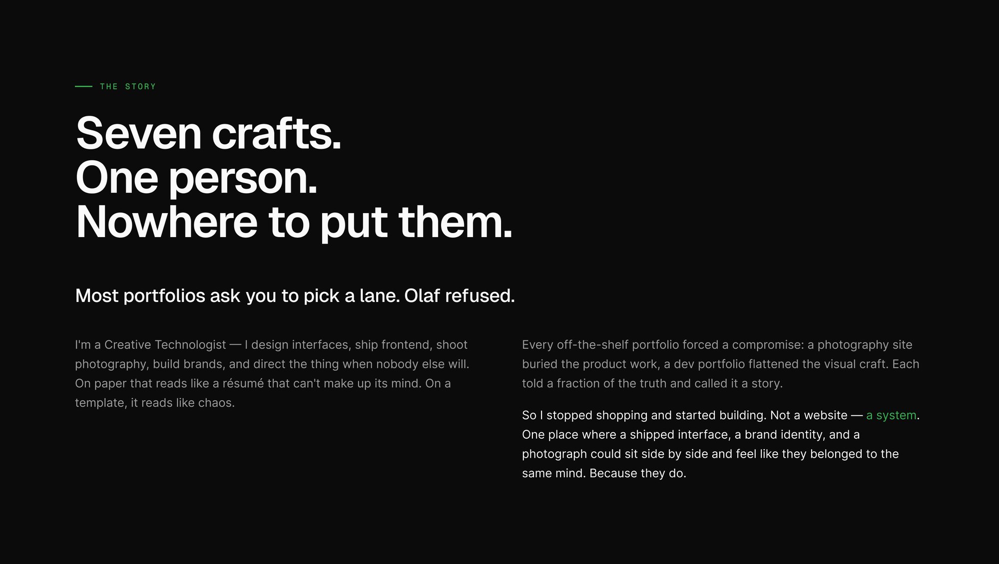
A creative technologist designs interfaces, ships frontend, shoots photography, builds brands and directs the work. On a template that reads as chaos — seven half-portfolios competing for the same page.
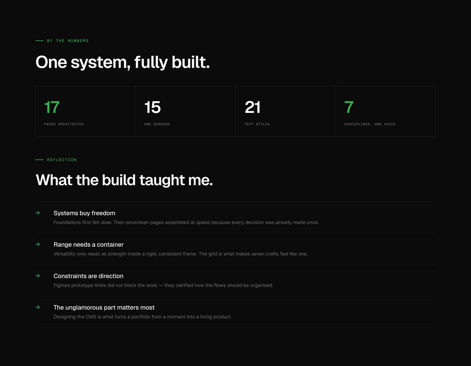
So the project stopped being a website and became a system: a token library, a component library, seventeen architected pages, and a fifteen-screen admin dashboard, assembled entirely in Figma before a line of production code existed.
- Client
- Self-initiated
- Role
- Product Design · Design Systems · Art Direction · UX Writing
- Tools
- Figma — variables, Auto Layout, interactive prototype
- Platform
- Responsive web, plus an admin dashboard
- Year
- 2026
The story
Every template forced the same compromise.
A photography template buries product work. A developer template flattens visual craft. Each one tells a fraction of the truth and calls it a story — which is a positioning problem long before it is a layout problem.
The brief that came out of it was blunt: one place where a shipped interface, a brand identity and a photograph sit side by side and read as one mind.
The problem
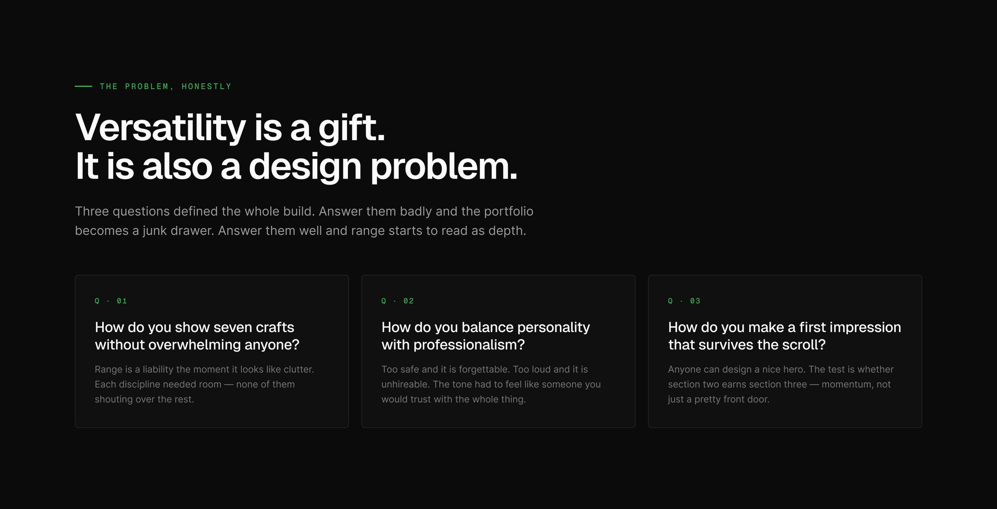
Three questions decided everything downstream.
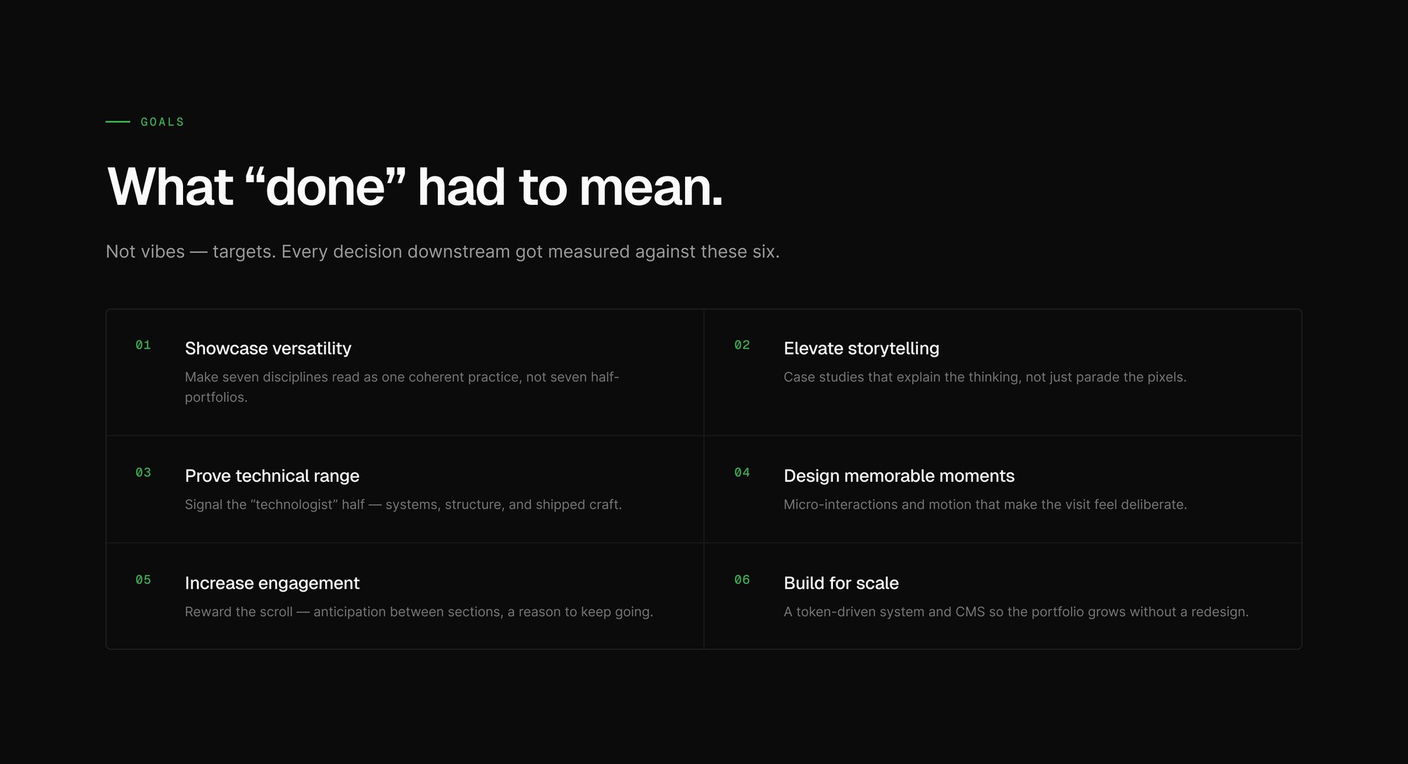
Three questions framed the whole build. How do you show seven crafts without overwhelming anyone? How do you balance personality with professionalism? How do you make a first impression that survives the scroll?
They were answered as targets rather than moods — six goals, from showing versatility as one coherent practice to building a system that grows without a redesign. Every decision downstream got measured against them.
Discovery
A reference audit, then a position — then pixels.
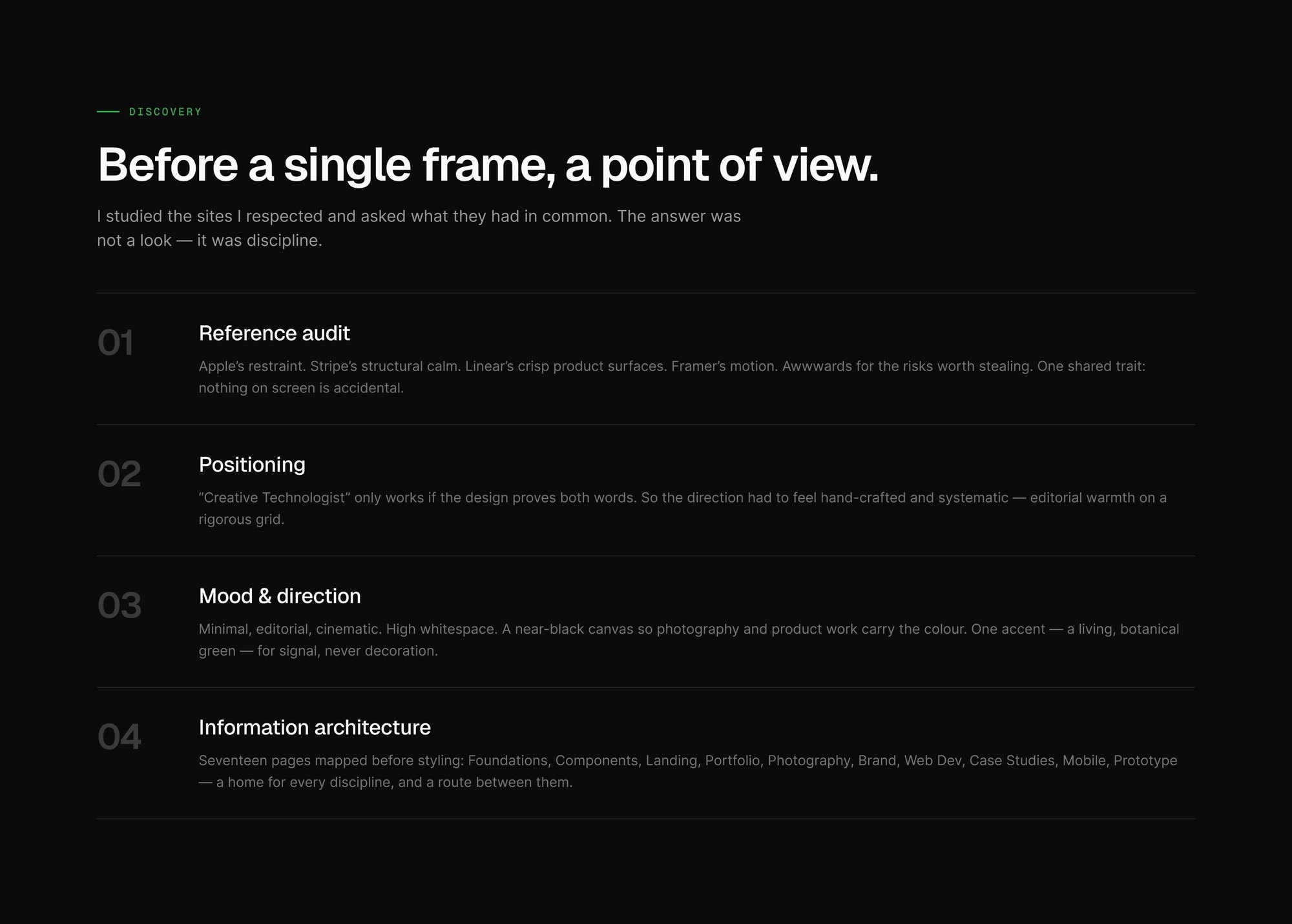
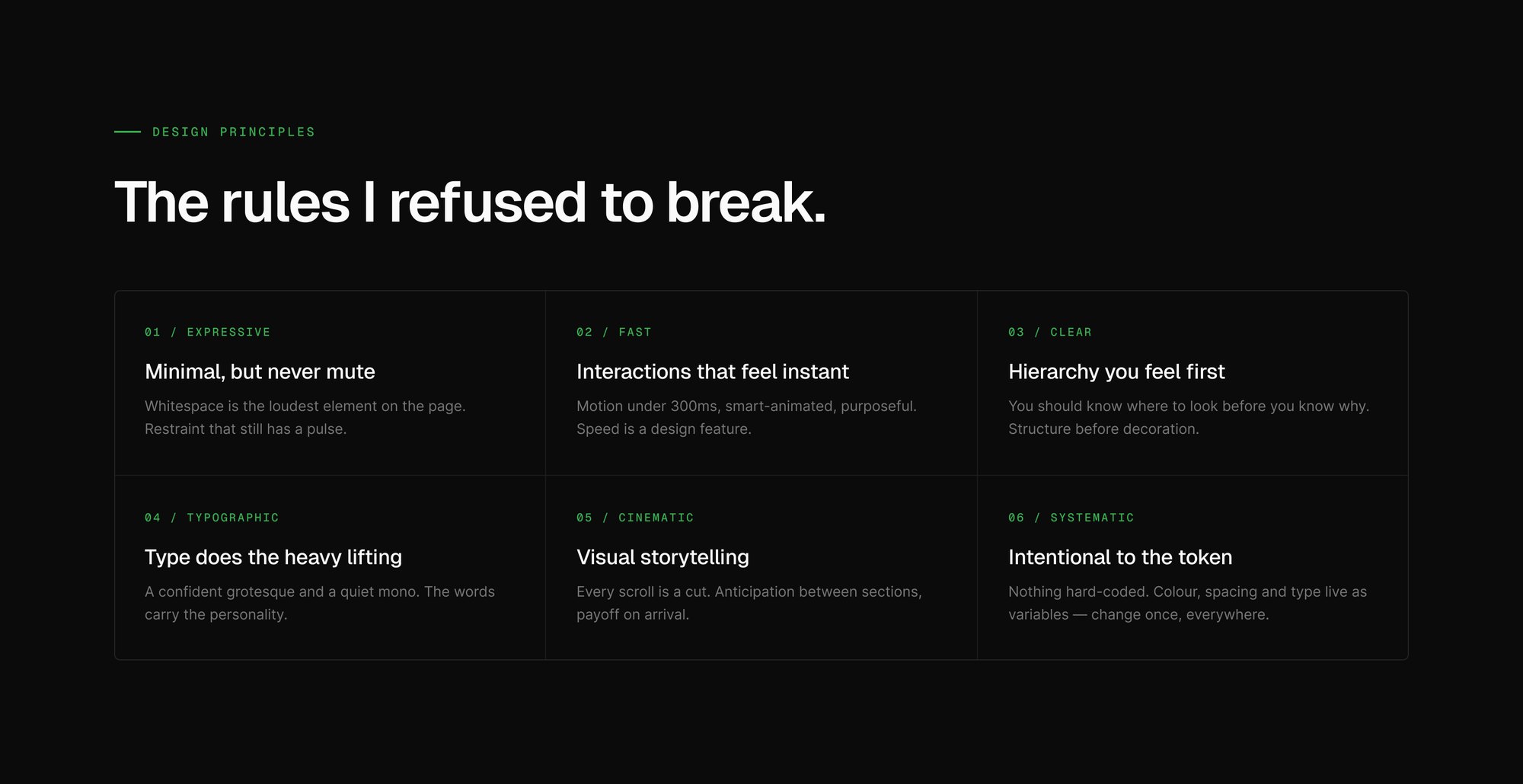
The audit deliberately compared sites that look nothing alike, because the question was not what to borrow but what they shared. What they shared was refusal — no element survives that cannot justify itself.
Positioning, mood and architecture were then settled in that order, and only then did styling start. Mapping the pages first is what stopped the portfolio becoming a folder of one-off layouts.
A portfolio isn’t a gallery. It’s an argument — and every pixel is either evidence or noise.
Foundations
Tokens before pages.
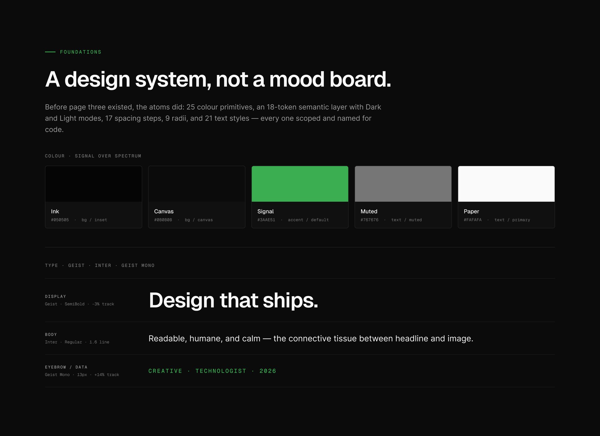
The atoms were drawn before any page was: primitives, a semantic layer over them, spacing, radii and a type ramp. Naming them for code rather than for a swatch panel is what let the Figma library and a future build share one vocabulary.
Two decisions do most of the work. A near-black canvas hands the colour budget to photography and product work, so the interface never competes with what it is showing. And a single accent means green always signals something — it is never available as decoration.
The unglamorous part
Fifteen admin screens, on the same tokens.
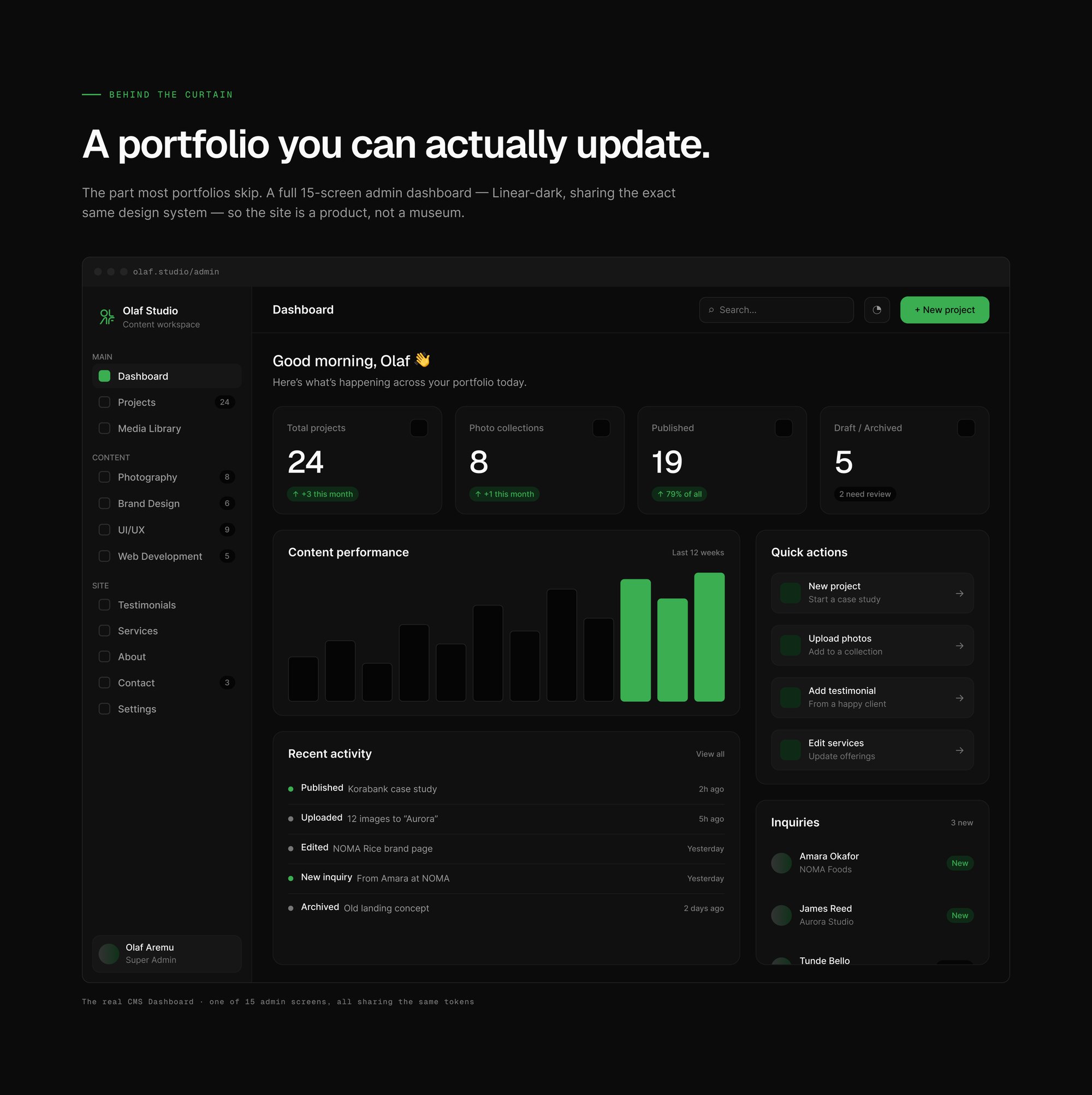
The part most portfolios skip: a fifteen-screen admin dashboard, drawn on the same tokens as the public site, so the thing is a product rather than a museum.
Designing the CMS is what turns a portfolio from a moment into something that keeps working — and it is the clearest proof that the token layer holds up under a dense, functional interface.
Reflection
Foundations felt slow, until they didn’t.
Foundations felt slow, then seventeen pages assembled at speed because every decision had already been made once. Systems buy freedom.
And range only reads as strength inside a rigid frame. The grid is what makes seven crafts feel like one practice rather than seven arguments.
Credits
- Design
- OLAF Studio
- Design System
- OLAF Studio
- Art Direction
- OLAF Studio
- Prototyping
- OLAF Studio
Next project
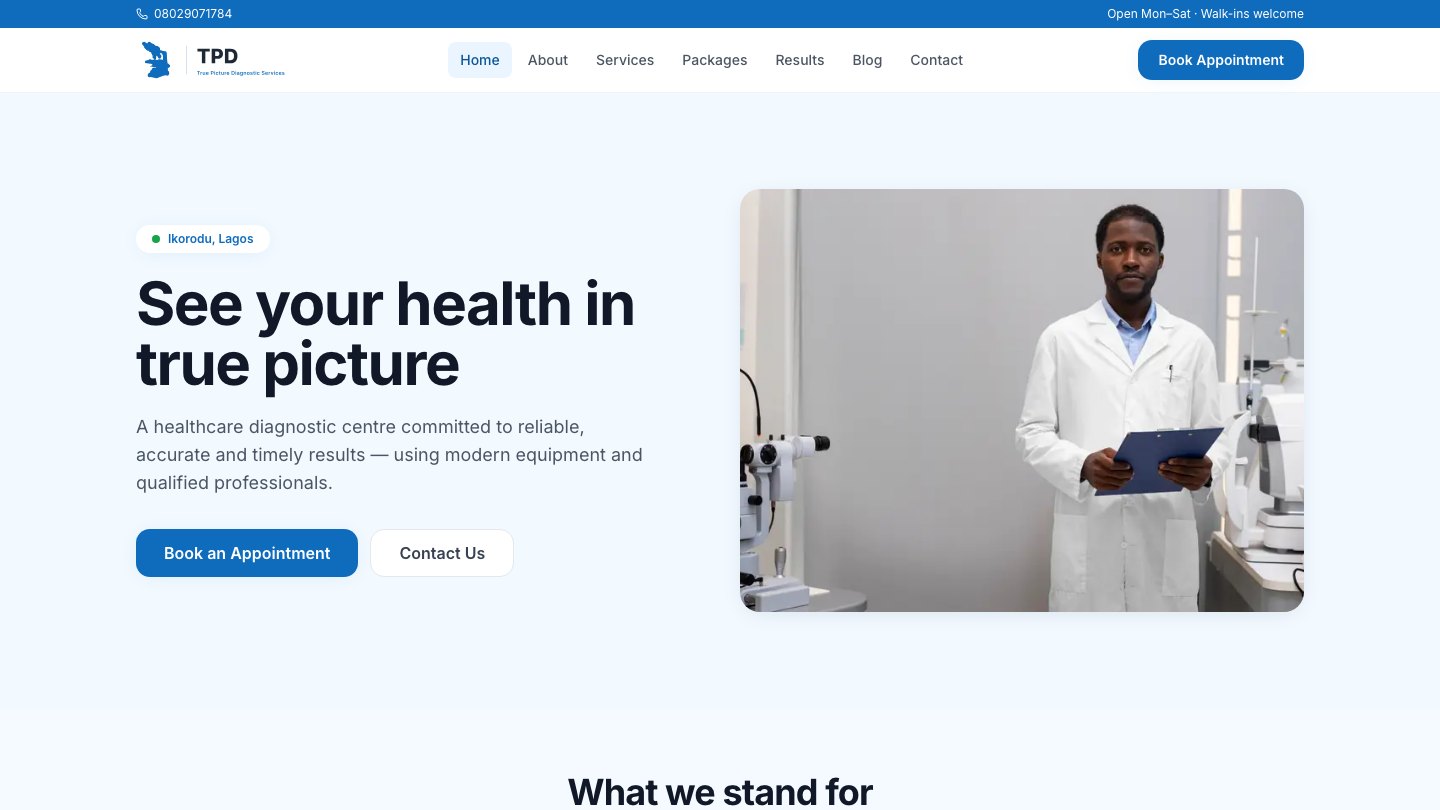
True Picture Diagnostic
DIGITAL / DESIGN2026True Picture Diagnostic Services