Thrum
Brand identity and system for an agricultural operating system
- Services
- Brand Identity · Design System · Art Direction · Motion · Packaging
- Client
- Thrum Technologies
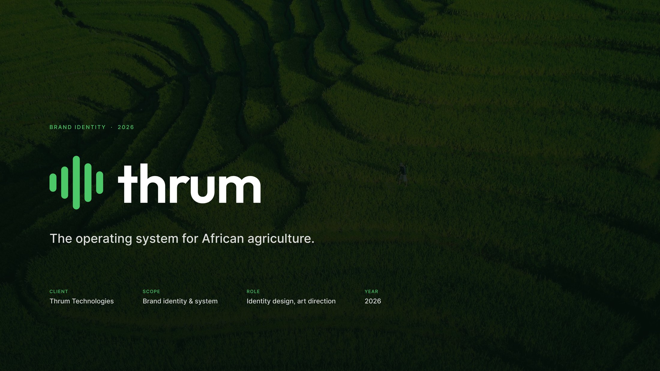
Agritech that hadto read asinfrastructure.
Thrum connects farmer management, commodity procurement, farm monitoring, inventory, financial services and field-agent operations into a single platform. The identity had to sit comfortably beside enterprise software and stay unmistakably rooted in the field.
That ruled out the obvious register — no leaves, no soil, no sunrise. What it needed was a system: one mark, one green, one grid, and enough structure to survive a favicon, a seed pouch and a dashboard on the same day.
- Client
- Thrum Technologies
- Scope
- Brand identity & system
- Role
- Identity design, art direction
- Deliverable
- 19-page brand manual
- Year
- 2026
The idea
A waveform, because a platform has a pulse.
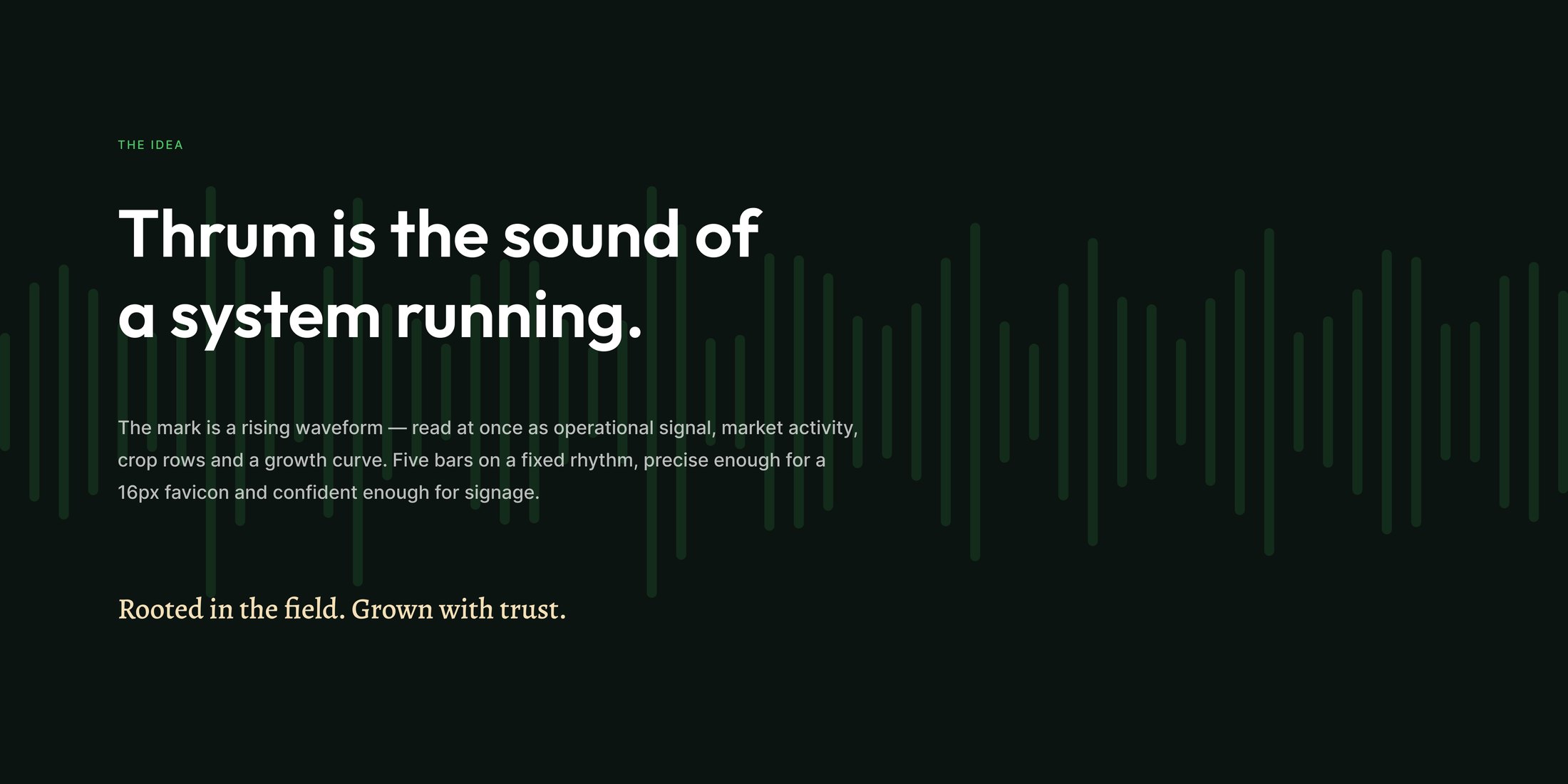
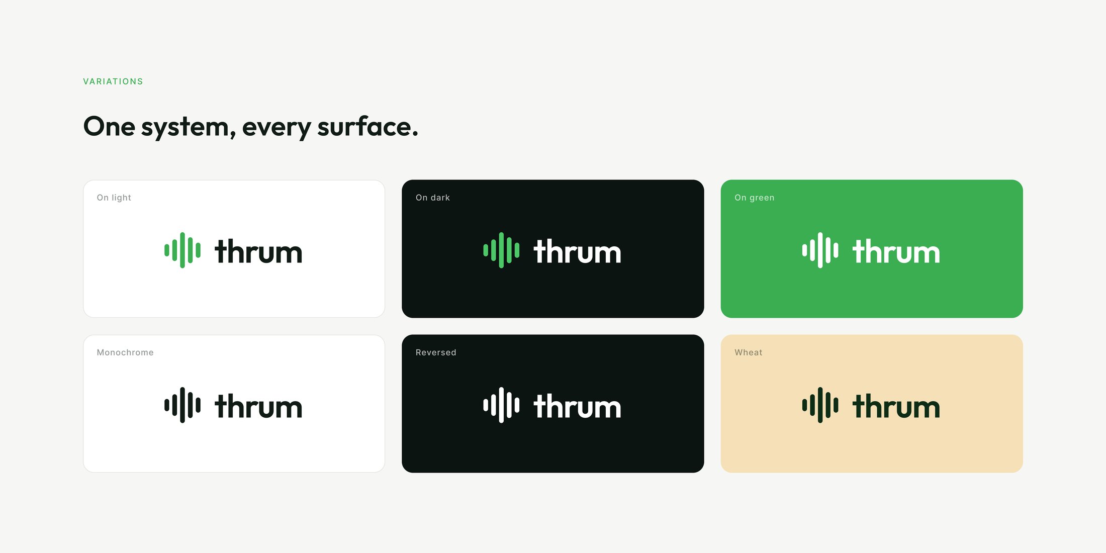
The mark reads four ways at once — operational signal, market activity, crop rows, and a growth curve. One shape covering the whole business is what stops an identity fragmenting the moment it meets a new product surface.
It is deliberately not a plant. A company selling reliability to buyers and lenders needs to look like something that runs, not something that grows.
Construction
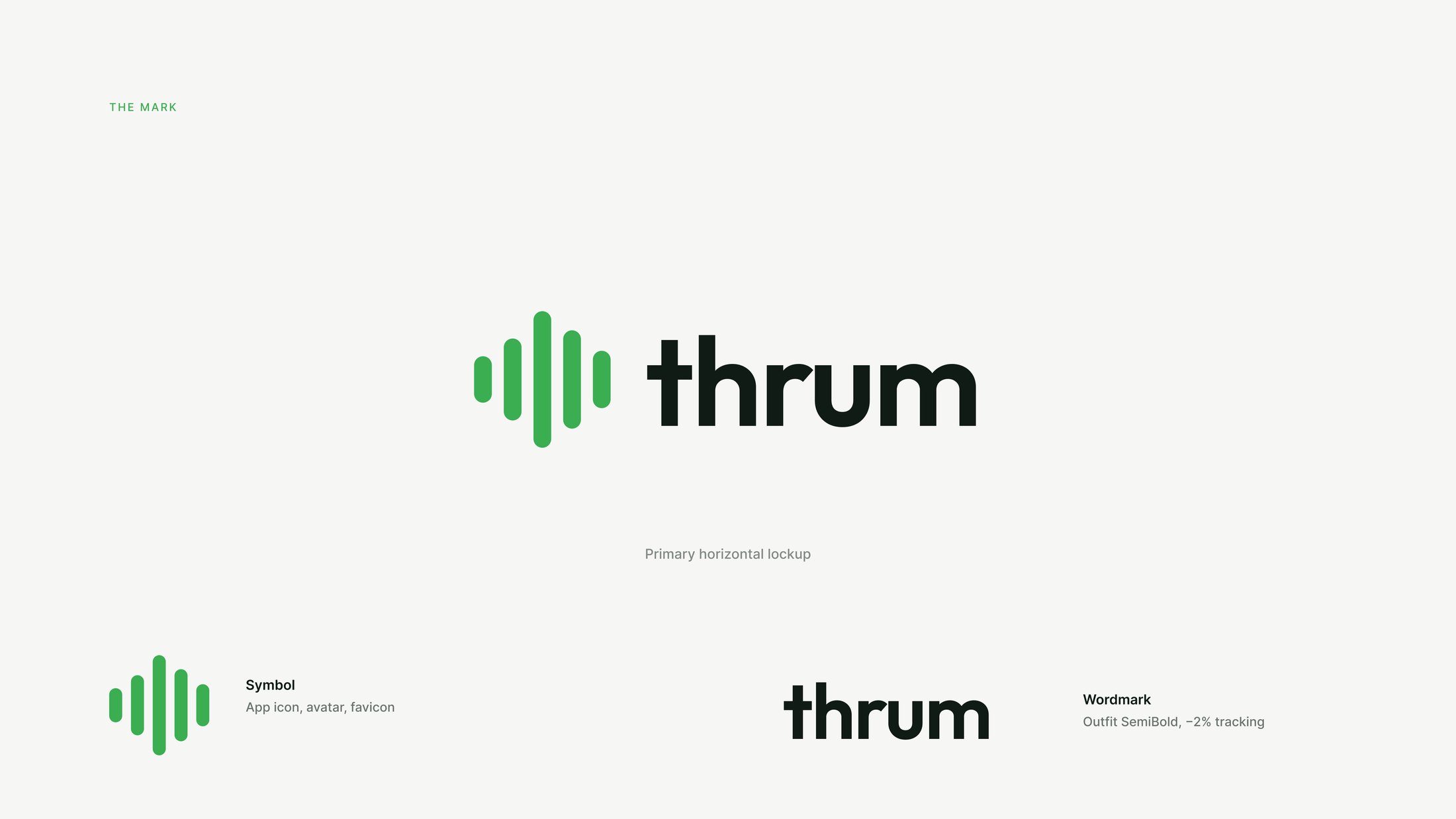
Five bars, one rhythm, no improvisation.
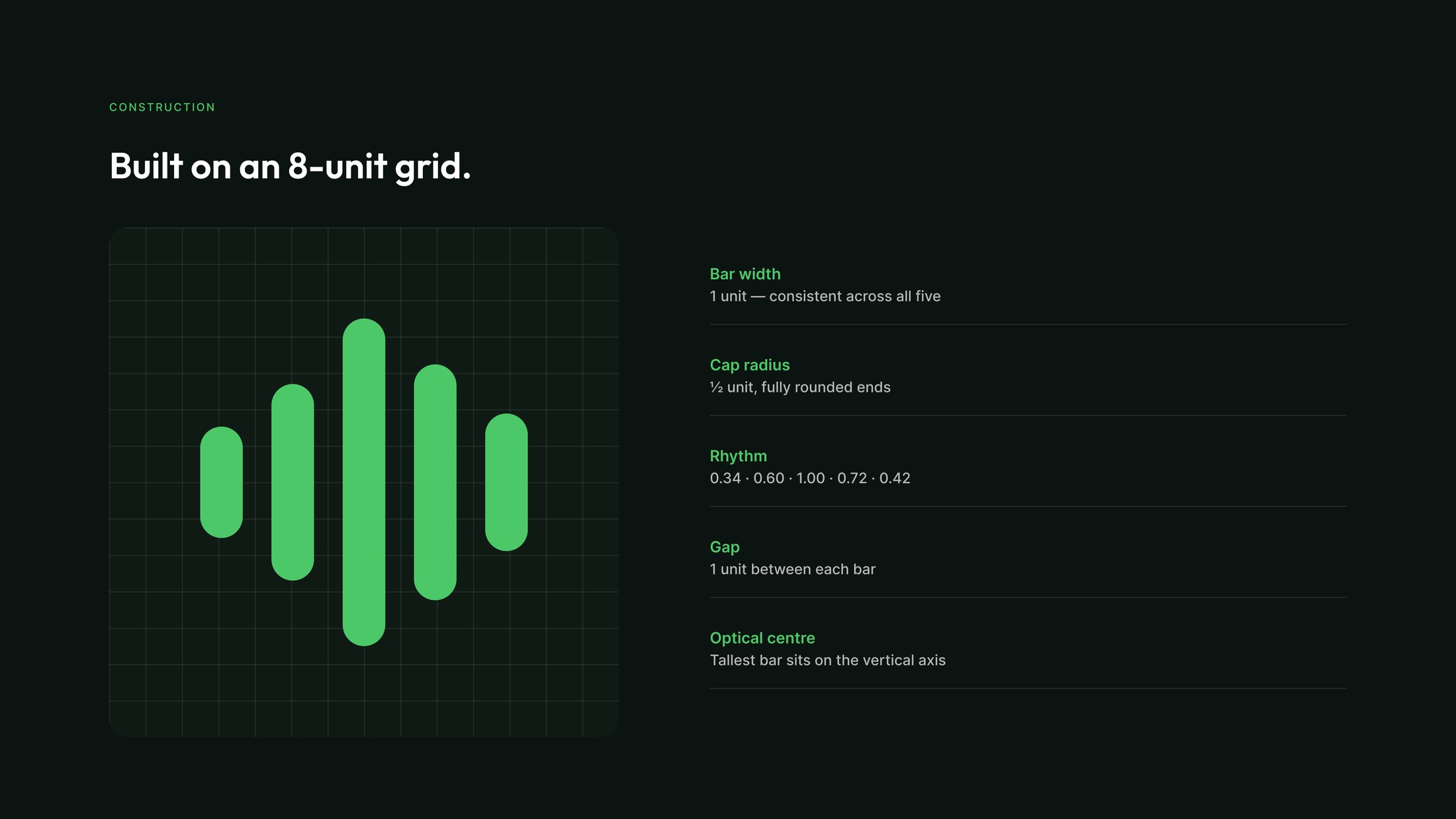
Every bar is one unit wide with a half-unit cap radius and a one-unit gap, drawn on an eight-unit grid. The heights follow a fixed rhythm — 0.34, 0.60, 1.00, 0.72, 0.42 — with the tallest bar sitting on the optical centre.
Fixing those numbers is what lets the mark shrink to a 16px favicon without turning to mush, and scale to signage without looking thin.
Colour
One green does the work. The rest keeps its distance.
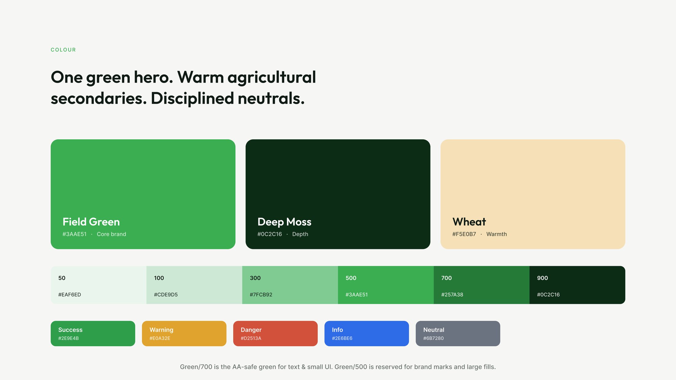
Field Green carries the brand, Deep Moss carries depth, and Wheat supplies the only warmth — a narrow palette on purpose, because agritech drifts into a swamp of greens the moment you allow two.
The ramp is split by job rather than by taste: Green/700 is the AA-safe value for text and small controls, Green/500 is reserved for marks and large fills. That one rule keeps the interface accessible without dulling the brand.
Type & icons
Three typefaces, three jobs.
Outfit is the voice — geometric, warm, matched to the roundness of the mark. Inter does the work, because dense operational tables are read, not admired. Alegreya appears only for the editorial line, where the brand is allowed to sound human.
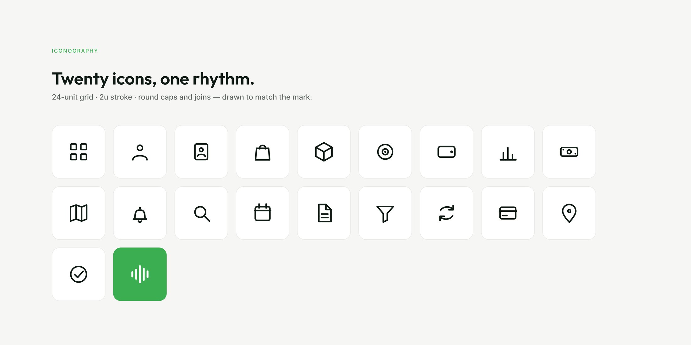
The twenty-icon family is drawn on a 24-unit grid with a 2-unit stroke and round caps, so it shares the mark’s geometry rather than merely sitting near it.

Pattern & motion
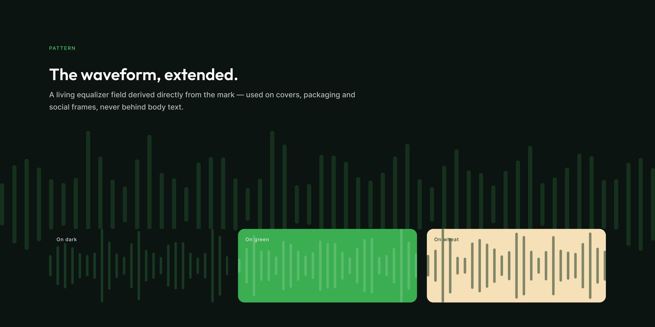
The mark, stretched into a field.
Extending five bars into a full equalizer gives the system a texture that is generated from the logo rather than decorated around it. It is allowed on covers, packaging and social frames — and explicitly never behind body text.
The same rhythm animates: a three-second sequence where the bars rise and settle into the lockup. The identity was drawn to move, so the motion is part of the delivery rather than a later favour.

Applied
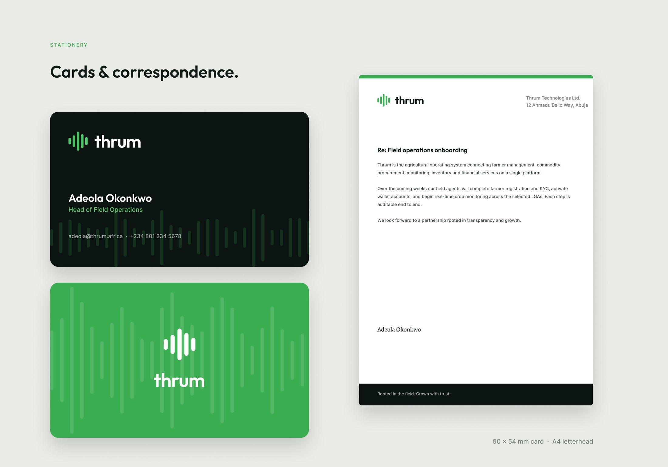
Off screen, into the hand.
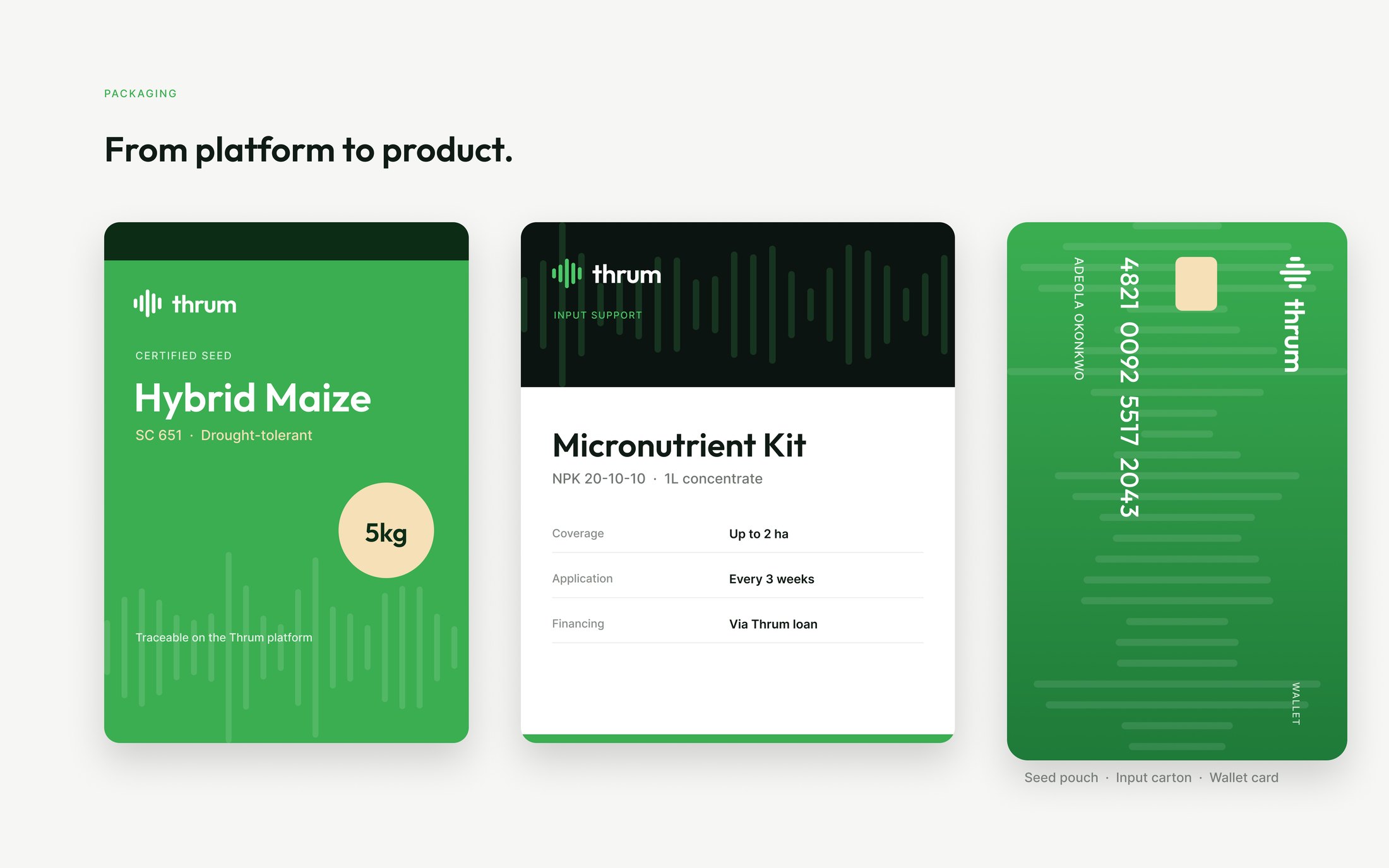
A card and letterhead for the office, then the parts that reach a farm: a seed pouch, an input carton and a wallet card. Each one carries the waveform at a different scale, and each proves the ramp works on a real substrate.
Packaging is where an agritech identity is actually tested — it has to survive print, a warehouse and a field, not just a presentation.
In product
Where the identity actually lives.
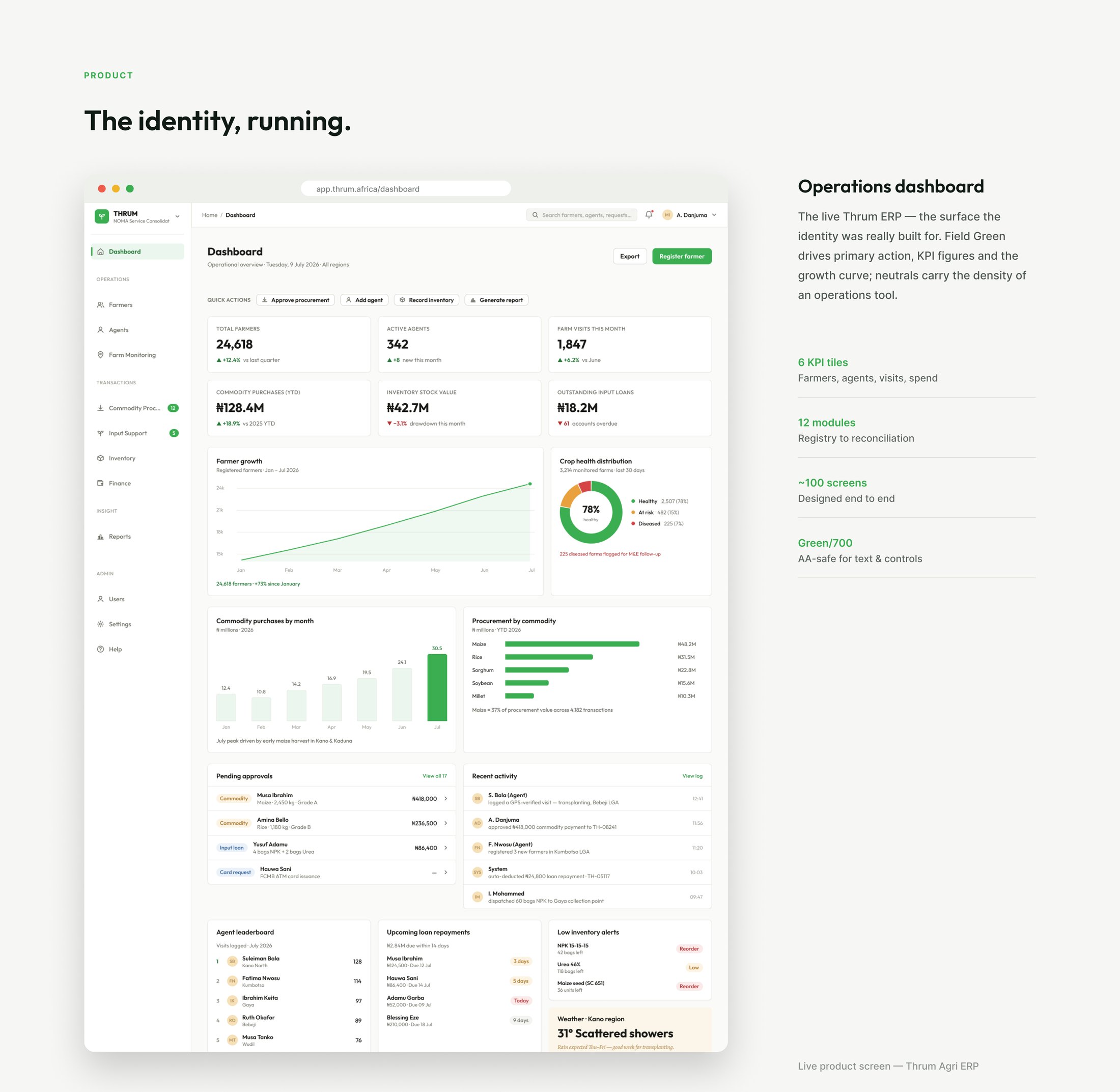
The system was built for the Thrum ERP — an operations dashboard fanning out to twelve modules across roughly a hundred screens, covering registry through reconciliation.
Field Green drives primary action and the growth curve; the neutrals carry the density an operations tool needs. Green/700 does the text and controls, which is the accessibility rule earning its keep at the only scale that matters.
Credits
- Identity Design
- OLAF Studio
- Art Direction
- OLAF Studio
- Motion
- OLAF Studio
- Client
- Thrum Technologies
Next project
Zentaii
DESIGN / VISUAL2026Zentaii